NEW to Digitalpress My little Photobook www.mylittlephotobook.com
'my little photobook' iphone app launched to transform iphone photos into beautifully printed little photobooks.
'My Little Photobook' is a joint venture between Sydney's Digitalpress owner Theo Pettaras and Melbourne-based IT and prepress professional, Tim Lucke. Both are respected experts in their own fields.
The idea of the app came about from a desire to find a better way to create photo books in a quick and efficient manner. Having a user-friendly interface was of paramount importance. The app allows for 20 printed pages that can be customised to have one, two, three or four pictures per page. They can be easily cropped and moved. Page order can easily be dragged and dropped. To create a book takes no more than a few minutes delivered within a few days for $29.95
Books are printed on a Kodak digital production printing press using the best grade satin paper available. All books are hand case-bound with fabric linen covers and presented with a belly- band and packaged for the perfect gift.
My Little Photobook was launched on the 25th May 2014 and has had an outstanding response to date. The books are ideal for weddings, parties, corporate events, memory books, kids, pets, and travel etc.
Download the App here. And visit www.mylittlephotobook.com
EXCLUSIVE OFFER TO DIGITALPRESS CUSTOMERS
Purchase a My little Photobook and receive 25% off.
Use 'DIGITALPRESS' code upon checkout
Order here
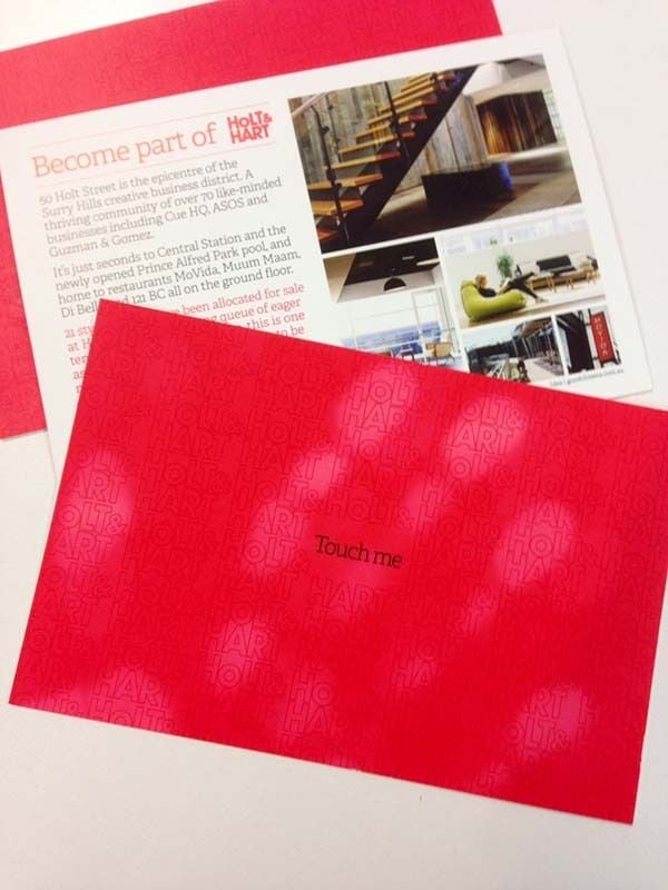
Pushing the print boundaries become part of holt and hart
 "Pushing the print boundaries become part of holt and hart")
The concept 'Become part of Holt and Hart' was brought to life through heat sensitive inks. As a potential buyer thumbs their way through the sales booklet, their fingerprints literally become part of the brochure.
Nik Robinson, creative director for Good Citizens, said "The experience is tactile and memorable; it's a well told story. It highlights the extent to which these developers are serious about the brands they develop; they understand that every piece of communication is an extension of the brand.Why can't a sales brochure have imagination? It's a key component of the selling cycle."
"If anyone was going to make this happen, it was going to be Theo and his team at Digitalpress. Together we searched the world to find the print technology to make this campaign happen. Of course we came across hurdles and problems but each time we found a solution and the end result is absolute quality."As well as the booklet, we decided to get real cut-through by mailing out 10,000 postcards, inviting people to 'Touch me' and become part of the building.
A nice touch and a nod to using local businesses and people, Good Citizens engaged all suppliers within 50 metres of the building to produce the booklet including photography by Rachel Kerr. Results so far: 6 of the 21 suites have sold.The Silver Invite A Sydney Children's Hospital Foundation's Signature Event
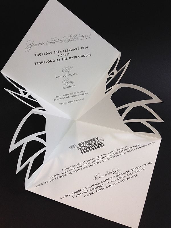 "The Silver Invite A Sydney Children's Hospital Foundation's Signature Event")
silver is one of sydney children's hospital foundation's signature events, now in it's 14th year, held at bennelong at the opera house and hailed party of the week every year by sun herald since inception, was the kick-off party for the year's social calendar in sydney.
This top charity fundraiser on Sydney's social calendar, and attracts the great and good of Sydney society. Delectable bites were served by top chef Matt Moran and his team at ARIA, Moet & Chandon champagne toasts were raised, and shimmery cocktails were by Belvedere.
Silver 2014 aims to raise much needed funds for the Cardiothoracic Department at the Hospital. The money raised goes to specially train paediatric surgeons in Cardiothoracic Surgery and also fund new and vital equipment for the operating theatres. The complexity of caring for children with heart abnormalities not only spans clinical and nursing staff in this specific domain, but those in other areas of the hospital such as ICU. Children as young as 6 months of age can require heart surgery, sometimes 'interventional' and the fixing of issues such as valve leaks, through to more complex conditions such as tumours on the heart and sudden heart failure.
Heather Hawkins designed the invitation which includes a beautiful intricate laser cut of the iconic Opera House.
We printed this stunning invitation in CMYK with a dimensional printing a clear foil applied digitally to further enhance the speckled effect. White foiled on the outside and silver foiled on the inside then diecut to the shape of the Opera House sails. Stock used KW K.W.Doggett Fine Paper Curious Metallics Cryogen White 240gsm
You can help right now and donate or create a fundraising webpage here
Digitalpress Project // IDEN Issue 2 Journal, 'Make' Equilibrium Design: A collaboration.
Digitalpress Project // IDEN Issue 2 Journal, 'Make' Equilibrium Design: A collaboration.
We are proud to have been involved in this great project and proud to have collaborated with Equilibrium Design.
Here is some information reproduced with kind permission from Bec Paton.
The second issue of IDEN is now out and explores the theme of making in industrial design. "In conceptualising the print and digital publication designs for this edition of IDEN, we interrogated the theme of 'making' from a number of angles through the book design itself." Bec Paton, Equilibrium Design. See more here.
Equilibrium Ideation + Exploration
- We made a hand-cut 'M', which is the key graphic device utilised across the publicationto badge, sculpt pages and pattern.
- Given that making is at the core of a designer's work, (including our own work as visual communicators, as we ideate, explore, prototype and produce), 'MW: makework', has been used for the identity for this editionmake it work!
- The 'M' in pattern form embodies the momentum that making affords, as signified in the forward arrows discovered in the counter-spaces.
- Engaging with the content for each article, we 'made' abstracted representations that picked up on the themes within each text, generating a tonal visual vocabulary and para-text, rather than being pure illustration.
Equilibrium Prototyping + Producing
- We made several prototypes of the physical book to make a unique artefact. The digital artefact interestingly changed from prototype to product as soon as it was approved.
- We designed the physical book such that we could collaborate with Digitalpress to exploit current best-practice for digitally printed publications using: innovative environmental paper stocks; a five ink print process, matte fuser and machine gearing to give us vibrant and crisp reproduction; specialty binding; and, a double-crash-fold poster as the dust jacket. We hand-folded these.
- The digital version of the book exploits interactive PDF features to facilitate navigation of the document and be optimised for screen.
See more here.
)